2 Page Spread

|

This is the 2 page spread for my Special Edition issue of Eco World. All of the elements here are vector art created in Illustrator. I used InDesign to layout the grids and used the text wrap tool to make a text wrap around the branches of the trees. My concern here is that there is too much content for a spread this size.

Special Edition Cover

|

For this cover I used the same image but I moved some of the text around. I also added the banner "Special Edition" and placed it in the top right hand corner. I also added some text so I had to move some text to the lower right hand side. This special edition contains a story about Earth Day to help celebrate the special day

Week 3

|
By this point, I am feeling less overwhelmed with the assignments that are due. This week we focused on lab time, working on all of our work so far. This week I focused mainly on the 2 page spread that is due next week for the special edition magazine. I also focused on my design standards worksheet which is very critical for the class. Since I was unable to attend class last week, I was not able to gain any feedback on my assignments, therefore, was unable to make any revisions.

April Issue of Eco World

|


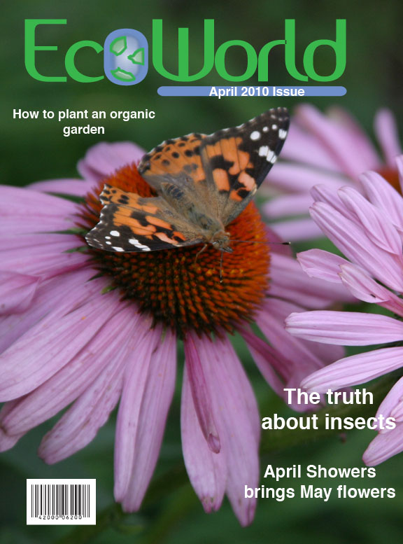
The April issue is done in full color to represent how the trees and flowers have bloomed in our own environments. I used my own stock image and took it into Photoshop to create the front cover. I kept the text very simple, because this month will also have a "special issue". I was able to keep all the display text one color since there was not too much contrast in the image.
The table of contents is not quite done here. I was playing with the idea of the butterfly for the table of contents as I used elements in the previous issues. I am waiting to get the feedback needed to proceed with this portion of the assignment. I did keep the logo and "in every issue" consistent as I did with the months before.
The back cover is another ad to help promote doing our part to keep our environment safe. I used an image I took myself and felt the tag line worked perfectly for this piece. Since we are unaware of what is ahead of us, we should all do our parts to keep our environment clean.

March Issue of Eco World

|


For the cover of the March issue, I used another personal photo and took it into Photoshop to manipulate. I did selective color for this image since spring time represents the rebirth of nature. I wanted to add some fresh color to bring us away from the black and white images used previously. I still used white, blue, and green for the display fonts. I kept the logo consistent with the other two issues as far as size and placement is concerned.
For the table of contents, I wanted to keep simple shapes and elements here. I decided to link the cover with the table of contents by making the text fit into simplistic flower pedals. I kept the logo and "in every issue" the same as the first 2 assignments. I think this look is fun and yet easy to read.
The back cover ad is a start of a new campaign. The purpose of the ads are witty little ways to say "reduce, reuse, and recycle". I used my own stock photography and took the images into Photoshop to ad. These ads are meant to be inspirational by showing the beauty of our environment.

Week 2

|
I was not able to attend class this week, but I still continued to work on my next assignments. During this week I was to create the cover, table of contents, and back cover for the March and April issues of my magazine. During this week, I gained more confidence in my ability to work at a much faster rate than the week before. I think once I had a base design layout figured out, the rest just fell into place.

Feb. issue of Eco World

|


Once again, I used my own image for this Issue. I found a photo that I took during the winter and decided it was perfect for this issue. After doing the first cover, this one seemed to fall into place much quicker. The challenge I was facing here, was trying to maintain the readability of the text on such a high contrasted background. For this cover, I decided that less text was the best for this design.
For the table of contents, I kept the placement of the logo and "in every issue" elements consistent with the previous issue. I also decided that I liked the element of the vertical colored bar on the right. Like I did with the previous issue, I decided to keep the background images simple while lowering the opacity. The circles are to represent snowballs for the cold winter month. Once again, I wanted nice, clean elements for this page.
The back cover is also a Rubik's Cube goes green campaign ad. I created this image in Photoshop by merging a few elements together to create the completed look. This is the last ad for this campaign, as the spring months will bring in a fresh new campaign.